Me@Walmart:
Building the Corporate Super-App
How I independently led UX strategy to transform 200 bookmarks and 12 fragmented HR systems into a single, AI-powered people experience — designing for trust, measuring outcomes, and defending research against org pressure at Fortune #1 scale.
A Fortune #1 company, drowning in 200 bookmarks
Walmart's Home Office associates — managing teams, approvals, onboarding, and career development — did it all across a fractured landscape of 12+ disconnected enterprise tools. The cost was measurable, the frustration was real, and nobody had solved it.
The Scale of the Problem
Every manager started their day not by managing their team — but by figuring out which of 12 systems held the information they needed. Workday for HR tasks. ServiceNow for IT. Concur for expenses. DocuSign for approvals. GuardianVantage for benefits. ULearn for training. Talent Marketplace for hiring. Plus SharePoint, Teams, OneWalmart, and a folder of 200+ bookmarks.
Managers across the organization are busy and have a difficult time navigating complicated systems to be their very best selves for their teams.
— Me@Walmart Product Problem Statement"People are just operating on information they learned from their manager... I need to know how to protect myself and Walmart, and if there are gaps in my knowledge to do that, that's my biggest concern."
— Home Office Manager, User Research Interview"I created a spreadsheet to make sure I have quarterly feedback sessions, career discussions, one on ones... I don't want anybody coming back at the end of the year saying you haven't even met with me."
— Eric Burnett, Home Office Salaried Manager (Persona Research)Principal UX Designer
I led UX strategy and vision independently for Me@HomeOffice — Walmart's SPIE (Single Integrated People Experience) super-app — including the flagship My Team mini-app, the AI Chat system, the Integrated Inbox, and the POI (Point of Interest) Framework. Three senior designers supported execution; the strategy, research program, AI workflow architecture, and design system principles were mine to define end-to-end.
4 Enterprise Systems Consolidated
Workday · ServiceNow · Concur · DocuSign — plus 8+ additional mini-apps — all unified under one AI-powered hub with shared data layer and single sign-on.
Estimated Business Value
At Walmart's scale, recovering 2 hours of daily productivity per associate across even a fraction of the 1.6M+ associate base represents billions in annual enterprise value. This wasn't a UX project — it was a business transformation with design at the center.
Watch 1-Minute Demo of Walmart Super App AI Chatbot Feature
Designing for real people, not user types
Every design decision was grounded in the lives of two distinct archetypes surfaced through 1:1 interviews, diary studies, and card sorting. Their frustrations weren't hypothetical — they were documented, quoted, and used to defend every design choice in stakeholder reviews.
A new or established people leader dedicated to enabling their team's growth. But too many systems, too many meetings, and too little time get in the way of actually doing the job they were hired to do.
A simple, connected experience to manage My Team, My Wellbeing, and My Career.
Motivated, ambitious, and immediately overwhelmed. Onboarding checklist in an email. Benefits in Guardian. Career goals in a Workday field nobody told him about. There is no compass, and he doesn't know how to ask for directions.
Having a baby? Navigate this yourself:
One app. Proactive. Personalized.
From "Portal of Links" to Transactional Intelligence
The breakthrough wasn't adding a new interface. It was fundamentally rethinking what a people platform could be — from a passive directory to a proactive AI assistant that anticipates needs, executes transactions, and guides associates through their most vulnerable moments.
Discover · Find · Do — The POI Framework
I invented the Point of Interest (POI) Framework — a "Discover, Find, Do" model for campus navigation. Instead of just showing a meeting room, the app anticipates the user's journey: notifying when to leave, providing turn-by-turn directions, and letting associates order coffee on the way.
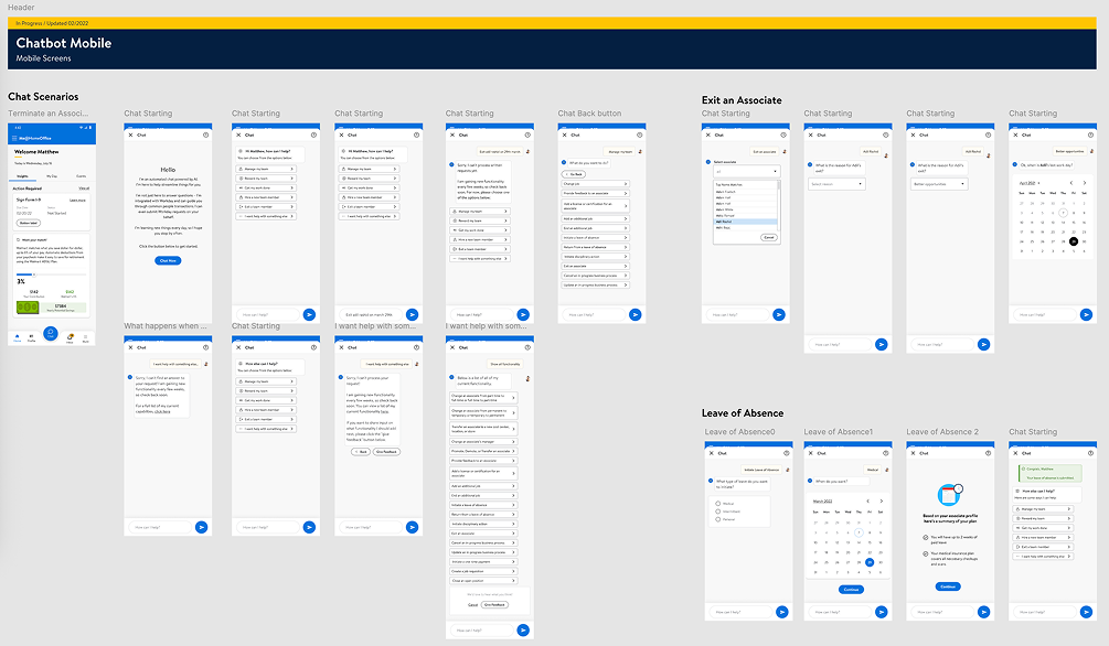
AI-Powered Conversational Assistant (Me@ Chat)
Transformed 20-step Workday processes into 2-step mobile flows. Designed a conversational AI that executes real transactions across 19 Workday use cases — with human-in-the-loop verification gates and NLP exception handling via Google Dialogflow.
Integrated Inbox — Cross-Platform Priority Queue
Designed a unified approval hub consolidating Workday, ServiceNow, Concur, and DocuSign. AI surfaces and prioritizes the most pressing items, eliminating context-switching and cognitive overload.
My Team — Associate-Centered Manager Hub
Rebuilt the manager experience around an associate-centered mental model (not task-centered), allowing managers to understand, support, and act on behalf of their team members from a single view.
Scalable Mini-App Architecture
Designed a modular framework so new experiences (Learning, Career, Health, Financial Well-being) can be deployed seamlessly without disrupting the core ecosystem — true platform-level design thinking.
The Core Insight
Associates didn't need a better dashboard. They needed a digital compass — something that points them toward the right action at the right moment, whether that's their next career step, a pending approval, or directions to their next meeting.
I reframed the product from a "people portal" to a "personal assistant" — and designed every interaction to validate that promise with evidence.
The Full Manager Journey Framework
I mapped the complete people-leader lifecycle across 7 stages: Find (recruit talent) · Welcome (onboarding) · Connect (team communication) · Engage (goals, feedback) · Grow (learning) · Further (career growth) · Manage Me (personal wellbeing). Every Me@ mini-app maps to one of these stages.
Design Breakthrough
By shifting from a task-centered to an associate-centered mental model, I unlocked a design architecture where managers find everything about a team member in one spot — reducing decision latency from minutes to seconds, and driving the SUS score from 73 to 92.5.
What the best super-apps in the world taught us
Before defining the architecture, I conducted industry analysis benchmarking Me@ against leading consumer super-apps, enterprise HR platforms, and corporate composite apps. The goal: identify what "excellent" looks like in each dimension of the product so we could exceed it.
The best consumer super-apps in the world succeed because they eliminate the question "where do I go for this?" We applied that same principle to enterprise HR — and the 92.5 SUS score proved it works.
— Design Strategy Rationale, Me@HomeOffice SPIEUnlocking potential at enterprise scale
The business goals matched the ambition of the company — reducing friction for 1.6M+ associates while building an AI-driven platform that could grow modularly for years.
Unlock Associate Potential
Empower every associate to realize their potential through well-being support, career navigation, and proactive guidance embedded in their daily workflow.
Operational Efficiency at Scale
Recover 2 hours of daily productivity per associate — an enormous ROI at 1.6M+ scale. Reduce searching costs, switching costs, and cognitive load simultaneously.
Modular Scalability
A mini-app framework where Learning, Career, Health, and Financial Well-being experiences can be deployed without disrupting the core architecture.
Manager Enablement
A single anchor point for people leaders to support their teams through onboarding, transitions, feedback, and performance — without Workday navigation.
AI-Driven Intelligence
Leverage ML to surface the right information, the right approval, and the right career nudge before associates have to search — anticipate, don't just respond.
Associate Listening Culture
Reinvigorate Walmart's feedback culture through MyIdeas — a direct channel for associates to contribute ideas, save time, and earn meaningful recognition.
What I focused on — and what I deferred
With 12+ systems to consolidate and hundreds of use cases to support, focus was everything. These were the non-negotiable UX priorities I established, ranked, and defended through every design drop.
Radical Cognitive Load Reduction
Consolidate all actionable items into a single AI-prioritized Integrated Inbox. Associates should never check five systems to know what needs their attention today.
Associate-Centered Predictability
Every manager finds everything about their team member in one spot. Research revealed managers operate with people — not tasks — as their primary mental model.
Proactive Just-in-Time Guidance
Use AI nudges to surface career opportunities, financial wellbeing tips, and onboarding checklists exactly when associates need them — not buried in a menu.
Human-in-the-Loop AI Controls
Every AI workflow includes verification checkpoints — Submit, Back, and Confirmation screens — so associates feel in control before committing to irreversible actions.
Mobile-First, Desktop-Accurate
Mobile for time-sensitive approvals and quick checks. Desktop for high-precision, data-heavy tasks. No feature designed for one platform and bolted onto the other.
Research Methods I Ran
1:1 Virtual Interviews (Zoom · 1hr · 6–11 participants per round)
Mental model mapping, pain point excavation, task-based testing
Diary Studies (2 weeks · contextual app usage)
Longitudinal behavior tracking — when, where, how the app was actually used
Card Sorting (IA Validation · open + closed hybrid)
Aligned information architecture with user mental models for profile, career, and financial data
Iterative Usability Testing (SUS · SEQ · task completion)
Multiple drops; SUS scored each iteration to track improvement
Mixed-Methods Survey (NPS · CSAT · UX Lite · quantitative + qual)
Established digital experience baseline for each product drop
The Pivotal Research Finding
Managers don't think in tasks — they think in people. When I restructured My Team around individual associates instead of action categories, task success rates jumped and the SUS score climbed 19.5 points. One research insight, one architectural decision, measurable outcome.
The real problem wasn't missing features — it was fragmentation
Root Causes Uncovered by Research
Platform Burnout
Associates drowning in 200+ bookmarks and 12+ tools, creating cognitive overload and job-related stress.
The Productivity Gap
Up to 2 hours of productivity loss per associate per day from context-switching and searching costs.
Manager Friction
Leaders couldn't support their teams during vulnerable moments — onboarding, exits, transfers — without navigating Workday's complexity.
AI Trust Gap
100% of users in one test round didn't understand the chatbot's purpose — many thought it was Zoom or Teams.
Technical Trust Erosion
PIN code failures, VPN requirements, slow loading, and duplicate data entries in Drop 0 actively discouraged adoption.
How Might We… (Research POVs)
The choices that defined the product
At Principal level, the most important design work happens in the choices you don't make. Here are five moments where I had to choose a direction, defend it with research data, and live with the organizational consequences.
UX as a strategic function, not a service team
At Principal level, design influence extends far beyond pixels. I operated as a strategic partner across Business, Product, Engineering, HR, Legal, and AI/ML — advocating for users when priorities conflicted, aligning teams around shared principles, and leading decisions that required organizational courage.
Defending the Associate-Centered Data Model
Engineering proposed a task-based API (actions as top-level endpoints) matching Workday's architecture. I pushed back with research showing managers think in people, not tasks. Led a joint design-engineering workshop to redesign the data contracts around associate profiles as the aggregating entity.
✓ Re-architected data layer shipped Drop 2 → enabled 92.5 SUSBlocking a Confusing Feature from Shipping
Product stakeholders wanted My Org as a high-visibility Drop 1 feature. Research showed 4/5 users didn't understand it. I prepared a findings presentation with usability quotes, task failure rates, and a redesign proposal. Successfully deferred the original scope to Drop 2 with a research-validated replacement.
✓ Avoided shipping a confusing feature · Drop 2 My Org: 95 SUSTranslating HR Policy Into Interaction Design
The "Exiting an Associate" workflow required deep collaboration with HR and Legal to map policy rules (voluntary vs. involuntary exit, remote vs. in-office, final paycheck timing) to UX decision trees. Designed compliant, humane guided journeys during a vulnerable moment for both manager and associate.
✓ Compliant guided exit workflow · zero escalations post-launchBuilding the Research Program from Zero
No standing UX research cadence existed when I joined. I established the full program: recruitment criteria, usability testing protocols, diary study design, card sorts, longitudinal surveys, and a findings repository that Engineering and Product actively referenced in sprint planning.
✓ SUS improved 73 → 92.5 across drops via research-driven iterationCo-Designing AI Exception Handling
When NLP intent parsing failed in early Dialogflow logs, I worked directly with the AI/ML team to identify model vs. UX failures. Redesigned confirmation and disambiguation flows that reduced user-facing errors while giving the model cleaner training signals from structured user responses.
✓ Chat abandonment reduced · 62.5% AI task completion rateGoverning AI for Production-Grade Security
Ensured the AI's data access strategy was reviewed and approved by Walmart InfoSec before shipping. Led tone governance work with the Living Design (LD) playbook team to define communication boundaries for high-stakes AI tasks like employee exits and demotions.
✓ AI shipped with full InfoSec approval · tone framework adopted org-wide⚡ The Hardest Organizational Moment
Engineering estimated the associate-centered data model would add 6 weeks to the Drop 2 timeline. Product wanted to revert to task-centered to ship on schedule. I facilitated a three-way session with Engineering, Product, and a senior HR stakeholder — presenting research data and projecting what a task-centered model would score in usability testing. The 6-week extension was approved. The 92.5 SUS score vindicated it.
How I Operated at Principal Level
Led the 4-in-the-Box partnership: Business · Product · Engineering · Design
Presented findings directly to VPs and Sr. Directors to influence roadmap
Directed 3 Sr. UX Designers with creative direction + quality review
Created Confluence design libraries adopted as standards across the SPIE program
Facilitated cross-team design critique sessions to maintain quality across mini-apps
Managed vendor integration guidelines for 4 partner enterprise platforms
Scope of Influence
4+
Partner engineering orgs aligned
6+
Research studies designed & run
3
Sr. Designers directed
5+
Product drops influenced by UX strategy
Design-led AI that's measured, not assumed
I operationalized a rigorous measurement framework to prove AI value — not just in sentiment scores, but in behavioral engagement, task completion, NLP exception analysis, and iterative optimization loops across every product drop.
AI Design Philosophy: "Safeguarded Automation"
The Me@ Chat wasn't built to feel smart — it was built to be trusted. Using Google NLP and Dialogflow, I designed a feedback loop where every exception in user interactions became data for the next design sprint. Confidence Gates (submit screens, back navigation, in-flight checklists) transformed risky automation into a trusted digital assistant. Goal: transform 20-step Workday processes into 2-step mobile conversations.
Measurement Framework
🎯 SUS Score Progression
Tracked SUS every drop: 73 (Drop 0 baseline) → 89 (SPIE mobile) → 92.5 (My Team). Each improvement was tied to specific design changes surfaced by research, creating a closed evidence loop.
📈 Behavioral Engagement Tracking
WAU (Weekly Average Users) and feature-level usage rates. Ask Sam AI: 62.5% vs. Manager Approvals App: 1.3% — this contrast directly informed next sprint priorities. Low-usage features got redesigned, not buried.
🧠 NLP Exception Analysis
Analyzed Dialogflow conversation failures with AI/ML team. Each "exception" — where the AI misunderstood intent — became a design prompt for refining dialogue flows and task categorization in the next iteration.
💬 In-Task Feedback Capture
Designed feedback prompts at the end of each AI use case, creating real-time signal loops between user experience and engineering optimization — a continuous learning pipeline, not a one-time evaluation.
Business & User Metrics
My Team — rated "Excellent" (industry top 10%)
Daily per associate via Integrated Inbox
Ask Sam usage — validating the AI value prop
Drop 0 → continuous improvement target per drop
Initial satisfaction baseline with improvement roadmap
Primary engagement KPI tracked per feature per drop
The rules I wrote — and defended
These weren't suggestions. They were guardrails I established to ensure every design decision across mini-apps stayed consistent, scalable, and purposeful — even as the team grew and new features were added by other designers.
🎯 Action or Benchmark-Oriented
Every insight must lead to a clear, actionable next step. If a user can see a metric but can't do anything about it, it's noise — not UX.
📐 Scale Content, Not Complexity
Add value without overwhelming the UI. More features never means more interface complexity. Ruthlessly prioritize what's visible at any moment.
⚛️ Atomic / Object-Oriented Design
Promote reuse and consistency across the super-app ecosystem. Every component is designed once, used everywhere — coherence at scale.
📱 Mobile-First, Desktop-Accurate
Mobile for quick checks and time-sensitive approvals. Desktop for high-precision, data-heavy tasks. Never compromise one platform for the other.
🤖 Human-in-the-Loop by Default
Every AI workflow includes a confirmation step. Associates must feel in control before the system takes irreversible action on their behalf.
🧩 Personalization Without Configuration
Use ML to surface relevant content by role, tenure, and behavior — but never make the user configure the intelligence. It should just work.
Platform-level thinking — not just feature design
One of the most overlooked Principal-level contributions on this project: I defined the design system foundation that enabled all subsequent mini-apps to ship with consistency, speed, and coherence. These weren't design decisions for one screen — they were decisions for the entire platform.
Atomic Component Library
Cards, pills, action items, and inbox patterns designed for reuse across all mini-apps. Adopted by 3 supporting designers.
Typography Hierarchy System
Label · Body · Title · Display hierarchy applied consistently across mobile and desktop experiences.
AI Interaction Patterns
Standardized confirmation gates, back-step navigation, disambiguation flows, and feedback prompts for all AI workflows.
Mobile/Desktop Breakpoint Standards
Defined which interactions belong on mobile vs. desktop, preventing the "bolted on" feel of single-platform designs.
Navigation Shell Framework
The modular mini-app container architecture that allows new experiences to be deployed without disrupting the ecosystem.
Confluence Design Guidelines
Documented standards adopted as the official Me@SPIE design specification across the entire program.
Why This Matters at FAANG Level
Principal designers at FAANG aren't measured by how many screens they designed — they're measured by how much leverage their work creates. A design system that enables 3 designers to work at the quality of 10 is a 3x force multiplier.
The atomic design principles I established meant that every new mini-app (Learning, Career, Health) could be designed and shipped without reinventing interaction patterns — each launch was faster than the last.
Inclusive design at enterprise scale
Accessibility was not a checklist item on this project — it was a design quality standard. With 1.6M+ associates of varying abilities using this platform daily, every accessibility improvement was a real impact at real scale.
Low-Contrast UI Audit & Remediation
Identified multiple low-contrast text and icon combinations across the platform during design critique sessions. Documented WCAG 2.1 AA violations and worked with engineering to remediate across all affected screens before launch.
WCAG 2.1 AA · VisualAI Chat Keyboard & Screen Reader Accessibility
Designed the conversational AI flows to be fully navigable via keyboard, with appropriate ARIA labels for dynamic content updates. Screen reader users could execute Workday transactions without mouse interaction.
WCAG 2.1 AA · Motor + Screen ReaderMobile Accessibility — Touch Targets & Dynamic Text
Enforced minimum 44×44pt touch targets across all interactive elements on mobile. Designed layouts to support Dynamic Type scaling without breaking information hierarchy, particularly in the Integrated Inbox approval cards.
Apple HIG · Android Material · TouchNotification & Alert Accessibility
Designed notification patterns that worked across visual, auditory, and vibration modalities — ensuring time-sensitive approvals were perceivable by associates with hearing or visual impairments.
Multi-modal · PerceivableSolving a Fortune #1 problem, end-to-end
Concrete deliverables and design outcomes — the kind that prove a Principal-level UX designer doesn't just execute screens, but shapes strategy, proves value with data, and builds systems that scale.
Built a Scalable Super-App Framework (from scratch)
Independently defined the UX architecture for Me@HomeOffice — a modular mini-app system consolidating Workday, ServiceNow, Concur, and DocuSign. Established design principles, pattern library, and interaction model adopted by all downstream teams.
Achieved a 92.5 SUS Score — Industry "Excellent" Tier
Through research-backed iterative design, drove the My Team mobile experience from a 73 (Drop 0 baseline) to 92.5 — placing it in the top 10% of enterprise software usability globally. Each improvement was traceable to a specific research finding and design decision.
Designed an AI Conversational System Across 19 Workday Use Cases
Led UX for Me@ Chat — a conversational AI that executes real Workday transactions in 2 steps vs. 20. Designed verification flows, error handling, NLP exception loops, and feedback capture to build trust and drive adoption to 62.5%.
Engineered the Integrated Inbox — Cross-Platform Approval Hub
Designed the one-stop approval system for Workday, ServiceNow, Concur, and DocuSign. AI prioritizes the most pressing items. Target: recover 2 hours of daily productivity per associate through context-switching elimination.
Invented the POI Framework — "Discover, Find, Do"
Created the strategic campus navigation model for Me@Walmart Campus. Associates don't just find a room — they get context-aware guidance, directions, and services delivered proactively, anticipating the next need before it's expressed.
Established Accessibility Standards Across the Platform
Conducted accessibility audits across the platform, identified WCAG 2.1 AA violations, and drove remediation with engineering. Established accessibility as a design quality standard — not a post-launch checklist — for all subsequent drops.
The work, up close
Key design artifacts from the Me@Walmart SPIE project — wireframes, journey maps, AI flow diagrams, research synthesis boards, and annotated screens. Each artifact documents a specific design decision, iteration, or research insight.
+
Add More Artifacts
Drop in Figma links, annotated screens, prototype previews, or accessibility audit screenshots.
What the project taught me
A Principal designer who can't reflect critically on their own work isn't growing. Here are five honest lessons from Me@Walmart — the things I'd approach differently, the constraints I'd challenge earlier, and the bets I'd make again without hesitation.
🔁 Ship Research Findings Faster
Our research-to-design cycle was thorough but slow. In hindsight, I'd establish a weekly "insight standup" with Product and Engineering to share findings in real-time, rather than batching them into reports. Speed of insight → speed of iteration.
⚡ Challenge the Drop Model Earlier
The "Drop 0 → Drop 1 → Drop 2" release cadence created pressure to ship features before they were research-validated. I'd push earlier for a "validated learning" gate before any feature enters a drop, making research an explicit input to sprint planning rather than a parallel track.
✅ Earlier InfoSec Involvement Pays Off
Involving InfoSec in AI design earlier — at the wireframe stage, not post-prototype — would have saved significant rework on the AI Chat security review. Security is a design constraint, not a launch gate. I'd make InfoSec a standing member of the 4-in-the-Box for any AI workflow.
♿ Accessibility From Day One, Not Day Thirty
Accessibility audits caught issues in the design review phase rather than at conception. In future projects, I'd integrate accessibility constraints into the design brief itself and test with assistive technology users in early-stage research, not only in final usability rounds.
🤖 Define AI Success Metrics Before Building the AI
We established NLP performance metrics mid-project. In hindsight, defining what "good AI" looks like (task success rate, exception rate targets, confidence thresholds) before engineering begins gives the whole team shared success criteria — and makes tradeoff conversations much faster.
📈 I'd Make the Same Big Bet Again
The associate-centered mental model redesign was the most controversial decision on the project — it added time, caused organizational friction, and required me to push back hard against stakeholders. The 92.5 SUS score proved it was right. I'd make that bet again, every time, with the same research behind me.
The biggest design lesson from Me@Walmart: research-backed conviction, delivered with intellectual humility, is the most powerful tool a Principal designer has. Not the prettiest prototype. Not the fastest ship date. The ability to say "the data says this, and here's why it matters" — and then be right.
— Personal Retrospective · Me@Walmart SPIE Program